


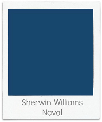
If you are looking for the perfect Blue Paint...not to dark but with just
enough brightness to make it a "happy" blue check out Sherwin Williams Naval. It has quickly become one of my go to Blues!
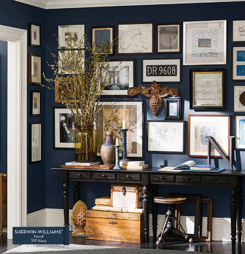
The contrast between the sharp white trim and the paint color creates and even brighter hue for the room.
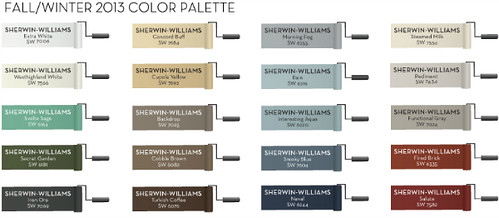
Twice a year Pottery Barn and Sherwin-Williams will create a palette to work with their new furniture introductions. The above collection certainly feels like fall with some versatile neutrals.
What room would you use this Blue in?
Check back to Color Time in the coming weeks for additional room images from this collaboration!
*Note:
The above room is the actual paint color not just a resemblance of
the color. As you can see above, the paint chip sample online
looks different than what is in the actual room photo. When
choosing paint for your own home never go by what you see online,
the color will always be a tad different. I suggest picking up a
small paint sample at the store and paint a color swatch in the
actual room, than you will never be disappointed!
(images from Pottery Barn and Sherwin-Williams)
(images from Pottery Barn and Sherwin-Williams)


No comments:
Post a Comment